As a graphic and web designer it’s important to set an example to and demonstrate the value of keeping up to date with design trends when it comes to logo and branding. Designing for oneself however is always the most difficult project to crack. This is mainly because it’s not easy making an objective decision on a design you’ve done for yourself, it’s too tempting to say ‘yes I like that’, or ‘omg no that’s not good enough, I must be really hopeless’. And sometimes it’s difficult to know where to start because the last time you did this you thought it was a ‘forever’ design! Designers also have a hunch we should working on a fee-paying project, not one just for ourselves – it’s too much naval-gazing (I hate that phrase). But when we do commit the time and effort to design and reflect on our own business it’s usually worth it, and does give an immediate buzz and boost the business. At the very least, it’s something to tell everyone about on social media!
The origins of Jo Menhinick Design Ltd and the logo
Way back in 1998 I went freelance after working in London for agency Bell Design (now called Bell Integrated Communications), as their Senior Designer for 7 years. Before that I worked for Scott Stern which was part of the WPP group – a big advertising group. The requirement for my own logo design became immediate when I needed to quote and invoice my first projects. I chose to base my first logo design on a Passion flower (Passiflora)because it was my favourite flower since childhood days. I wanted my logo to have a personal link which would always make me feel good about my business. This design served me well and I still quite like it.
By 2002 my business had grown and I felt I needed to bolster my corporate image a little with a logo that had more substance. The logo was ‘just a flower’ and could be perceived as a bit ‘soft’. This image didn’t really suit my industrial clients which were becoming the mainstay of my work.
 The next logo version was conceived, see below. This logo design carried forward the old design but with more solidity and depth. The flower became like a moon and a touch mysterious perhaps.
 By 2008 I needed something fresher to reflect the trends in recycling, regeneration and recycling which were all the rage in 2008. Whilst technically a simplified design, it wasn’t clean enough and in 2010 I ripped it all up and created design number 4.

This ‘paint splashes’ design worked very well for me and I still love the clarity of this design. It is totally unique and lots of people have commented on how much they like it. It is still tenuously based on the passion flower as the blue and pink strokes are based on the stamens of the flower, a subtle link. But, there was always something a bit sad about this design, it does look like tears or rain.
2016 is here, I want to look positive, professional and bold.
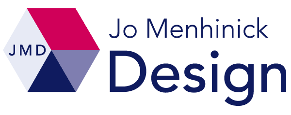
I wanted to keep some link with past designs, but design something completely different and up to date. This Hexagon logo does it all I think, for the next few years anyway. Although, technically if it were a passion flower it should be a Pentagon! The immediate appearance is that of a chevron perhaps, or an aeroplane tail fin. Folded paper engineering/origami also springs to mind. This geometric style is trending now and will set JMD apart from design companies will older style logos. It exudes confidence and professionalism whilst also totally unique and retaining femininity. The clever bit is how it works as a square icon as well as a rectangle. A square icon version of a logo is now an essential requirement if you’re going to compete for business in the social media environment. For starters, if you want your company website to work as a bookmark on a tablet or iphone, you must have a 512px x 512px logo. So it is more or less essential that your logo has a format for this. You can then load a compatible file for other social media too, such as Twitter, Linkedin, Pinterest, Instagram etc.
The hexagon motif on my logo hold the letters JMD and this element forms the ‘icon’ file. The PNG format (portable network graphics) allows the design to work over another colour or a photograph. So it will work well on sliders and animated gifs.
Key elements to a good logo design:
- Memorable
- Unique
- Excellent, appropriate typography
- Well drawn
- Has some link with the business it represents
- A clever graphic device perhaps. This means the logo represents on image and another simultaneously. My logo doesn’t really do this but the logo I created for St Paul’s Hostel illustrates this point well
- Vector format
- Works small or large
- Provides the outward company image the customer wants
- Communicates the relevant brand values
- Is up-to-date with current trends
- Competes well against competition
- Works on any application from a paperclip to an aeroplane!
