Tilley’s Sandwich Bar is located in Lowesmoor, a thriving area of Worcester near the centre. This ‘Corner-shop’ venue needed a boost to reinvigorate sales and interest in their delicious, freshly prepared fare. The owners Georgina & Pete approached me to refresh their menus and website, and while I did this I also took a fresh, objective look at how they were trading.
I gave Tilleys the ‘Mary Portas Treatment‘ – and it’s really working!
First I gave them some free advice on how they could improve things without even spending any money. Why would I do this? Well it’s in my interest that the marketing material I produce – menus and a website etc, works really well for their business. I have an experienced eye for what works and what doesn’t. This is because I am a professionally trained designer and have 20 odd years experience in communication. Good design is closely linked with effective communication. The team at Tilley’s really listened hard and within days they felt like they’d had a mini-makeover, before I’d even delivered the new menus or the website. They are a great duo to work with because they do really listen and put into action advice given.
Here’s some of the things I helped Tilleys with for free:
1. Pete and Georgina thought their cafe had ailing sales because of all the road works and general run-down feeling of their area. they also thought the local new Asda, just around the corner was leaching their customers. Well, I said “Make this into a marvelous opportunity to tell people how local and fresh your sandwiches and baguettes are. Asda can not say their food is locally made or freshly prepared on site as yours is. Turn your perceived disadvantage into a ‘Positive'”
2. The ‘A Board’ outside had three lamminated notices on white paper on both sides. Pete & Georgina said they were going to get a new A Board. I said ” The board is informative if you had time to stop and read and ok in the rain for weeks. It looks dull. But people want fresh words they can read in a glance, it makes the shop look like it really is preparing food fresh. Don’t buy a new A Board, just give this a coat of black board paint and hand-write short messages in chalk.”
3. The notices on the walls inside the sandwich bar also had printed and laminated menus and offer on them. I said ” Hand write all these boards like black boards with little doodles of sandwiches and anything else. It will look endearing and fresh. Georgina has beautiful handwriting, it’s really good enough for it’s own Font (if only I had time to create I would!), so this is a real bonus.” The boards work much better.

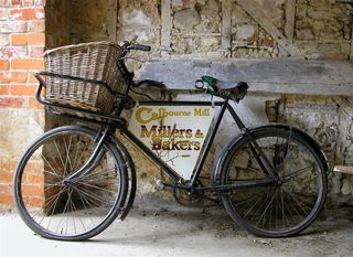
4. The shop is situated on the corner of the main Lowesmoor Road. The front looks smart but is passed so quickly by traffic and pedestrains, many probably just miss it. the name is high up, and as we all know, people don’t look up. I suggested: “Put some fresh flowers outside and a table and chairs so that people notice it’s a food venue. Also prop some Offer Boards against the window. I have also suggested they get an old bike with a sign that hangs down from the middle and a basket on the front. It will look cool and vintage chic.You can also wheel the bike round with basket full of sandwiches to the entrance of Asda and flog your wares legally there too!” ” Stand next to your competitors, don’t move away, if you’re better this will help people choose you!”
5. The other side of their premises fronts a traffic interchange, traffic lights, a roundabout and basically a golden opportinuity to get people looking at their shop while they waste time waiting for the b* lights to change! They have a window with bare wall on both sides, what a gift! I said ” Use this wall to advertise your shop. “ And then I thought a bit more and ‘ping’, – idea –“why don’t you make your window speak. Yes, we can make ‘Speach Bubble’ notice borads which you can write on, these will face into the window, so the Tilley’s window is doing the talking.” People should be able to see these signs when they’re coming down rainbow Hill!
Now onto the stuff I do for money…
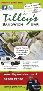
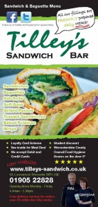
6. The menu’s I’d updated a few years agao so this was quite straight forward. I always carry my Nikon 3600 with me so I took a few piccys and came back to take more of their delicious sandwiches and baguettes. Georgina marked the old one, and my assistant Cath put in the new text. We suggested Tilleys make their Platters and Buffets service info on a separate sheets, so as not to cram too much in on the main menu. It didn’t cost much extra, and they have two give aways to display. Win Win. We printed 1000 off each.
Download the menus here if you like:
 7. The old Tilleys website just wasn’t doing anything good. It was one of those ‘free’ ones that promises all and delivers nothing. So, we basically rebuilt, new photography, all done here, new text, all done here. Menus added and easilly updatable. We update the website with their ‘Offer of the Week’ on the Specials and News page, which works like a blog. We also feature the special on the menu page so it’s really visible to customers online. A special feature which I update every week. An ordering system online. The possiblity to send email database newsletter to 500 customers in future is also a bultin feature of this tyoe of website.
Take a look at their website: www.tilleys-sandwich.co.uk
I gave Tilleys the ‘Mary Portas Treatment‘ – and it’s really working!
Testimonial from Pete & Georgina: “We really can’t thank Jo enough for the difference she has made to our business. She came in here like a breath of fresh air, and we were left wondering what on earth had hit us to begin with.The advice Jo gave first off , just walking around our place was all completely new and quite a shock for us really. We took things on board and have turned things around. The website is fantastic and we had an order through online the first day it went live. And now we’ve had many more. The printed menus are great too and the new Buffest and Platter menu is going to boost this area of our business very well over this year ahead. ” “Jo is always sorts out any queries we have with the printing, website, signage and our email and responds quickly to anything we ask. ”
All the advice I give is completely bespoke to the business in question.
If you’d like some free advice on how you can make things better for your business whether on a high street or in an office block or in your shed, please give me a call on 01905 767563

